 KINSMC
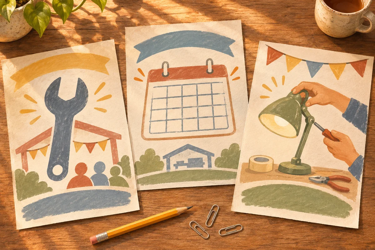
Three AI-generated flyer concepts can all look ready to publish. One might leave readers thinking a workshop sells repairs, another might hide when it takes place, and a third might make the booking step easy to find. You can uncover those differences with a short reader test. Show people the concepts in the setting where they would encounter them, give them a plausible task, and note what they actually do before asking which design they like.
Give each concept the same job
Imagine you are advertising a community repair workshop. A visitor can bring one household item and work on it with a volunteer. The event takes place on Saturday, and attendees need to reserve a place. You have three rough directions: a large wrench illustration, a calendar layout, and a scene of hands fixing a lamp. Each should answer the same three questions. What happens at the event? When is it? How do I book?
Make the three versions comparable before testing. Use the same date, booking wording and factual details in each. Show all three at the size and on the medium you expect people to use. If one version has complete text and another still uses placeholders, a reader’s answer may reflect that difference in content. If you want to compare different wording as well as layout, make a note that the test compares the whole concepts. You can change one element at a time in a later round if you need to isolate it.
Give people a task without giving away the answer
Choose a few people who resemble the audience. For this flyer, start with people who might genuinely attend a local event and who have never seen these drafts. The GOV.UK Service Manual on moderated usability testing recommends realistic tasks that leave participants to find their own way. The same principle works for this small flyer exercise. Decide before the session what counts as a successful answer, so the standard stays consistent across designs.
Try this prompt: “Your lamp stopped working and you see this flyer. What do you think you could do at the event? If you wanted to go, show me what you would do next.” Pause while the person looks. If they hesitate, ask what they are looking for. If they point to a booking button or QR code, ask them to explain what they expect to happen next. Make sure any experimental link leads to a test destination so participation does not accidentally create a real booking.
Record what readers do before asking about style
Keep a small worksheet with a row for each reader and concept. Record their first interpretation, whether they could find the event time and booking step, and any sentence they used to explain their choice. Write down where someone looked before what you think went wrong. “Read the illustrated heading and thought repairs would be done for them” gives a designer a more precise problem to investigate than “confusing artwork.”
For a quick comparison, start different people on different concepts. A person who already found the booking instructions on the first design may remember those instructions on the next one. If possible, use the first encounter to judge whether a reader can find the essentials and use the later comparisons to discuss layout preferences. Keep the results qualitative. A handful of sessions can reveal specific problems to fix, while the sample is too small to estimate what percentage of all visitors would succeed.
Revise the strongest direction and run the task again
Suppose readers understand the hands-and-lamp design fastest but miss the booking instruction. The next revision could place the booking step next to the date and give both more visual weight. Keep the wording and other details steady so the follow-up tells you whether the revised placement helped. If readers consistently misunderstand the illustrated scene, adjust the headline to say that visitors repair items with a volunteer, then try the task again with someone who has never seen the first version.
An AI assistant can help turn your anonymized notes into candidate revisions. Give it the observations and ask for two layout changes tied to specific problems you saw. Have a person check the suggested changes against the event facts, the available print space, and the practical booking process. Use a real browser or a printed proof for the final check, whichever matches how people will encounter it. If the booking step is still hard to find, the concept needs another revision even if everyone likes the illustration.
If your three concepts use the same idea with different colours, return to KINSMC’s guide to generating genuinely different ideas with AI. Once readers understand and can use the revised concept, check the final typography, visuals and message against your brief with the guide to keeping your brand voice in AI-assisted design.